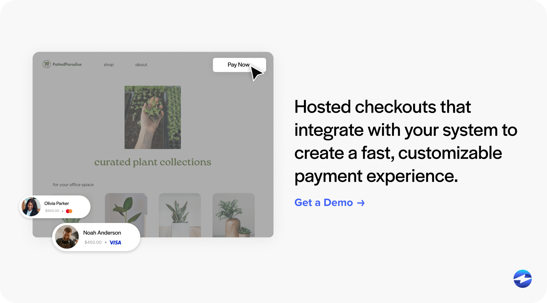
For businesses, having an intuitive and attractive payment page is absolutely essential for the completion of a purchase from a customer. Many checkout pages these days are time consuming and tedious which demoralize customers from finishing up a transaction and receiving the products that they desire.
Because the payment page is the final step of the process for your company to receive revenue, it’s crucial to have a simple and effective checkout process. This article will highlight 6 excellent examples of payment page designs that you can use to boost your own payment page and motivate customers to finish the payment process.
6 Unique Payment Page Design Examples
1. Dribble
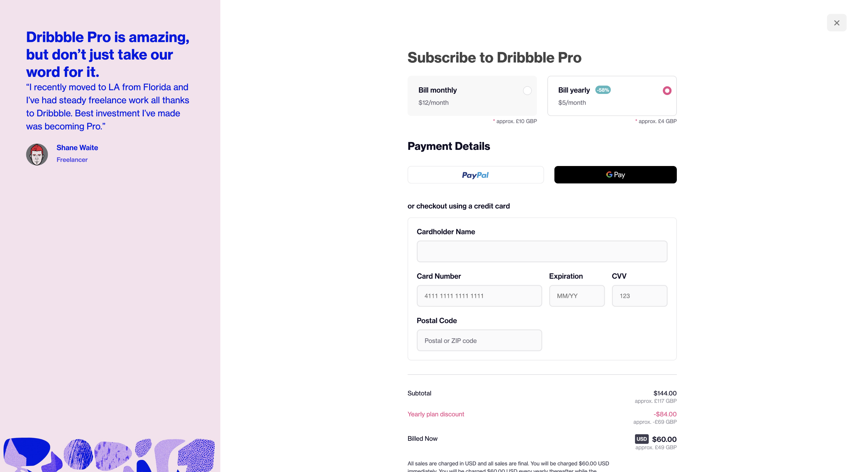
Biggest takeaway: This payment page highlights simplicity with an attractive interface creating an intuitive user experience.
This checkout design from Dribbble utilizes an intuitive user interface keeping the information fields to a minimum for customers. With an easier interface and less information to enter in, customers are more likely to finish the process and make the purchase official. It’s crucial for your business to keep your checkout page as simple as possible to motivate customers to finish up the payment process and get your company paid. The payment page has a clear and organized format with inviting colors that motivate anyone to easily finish the transaction.
2. Etsy
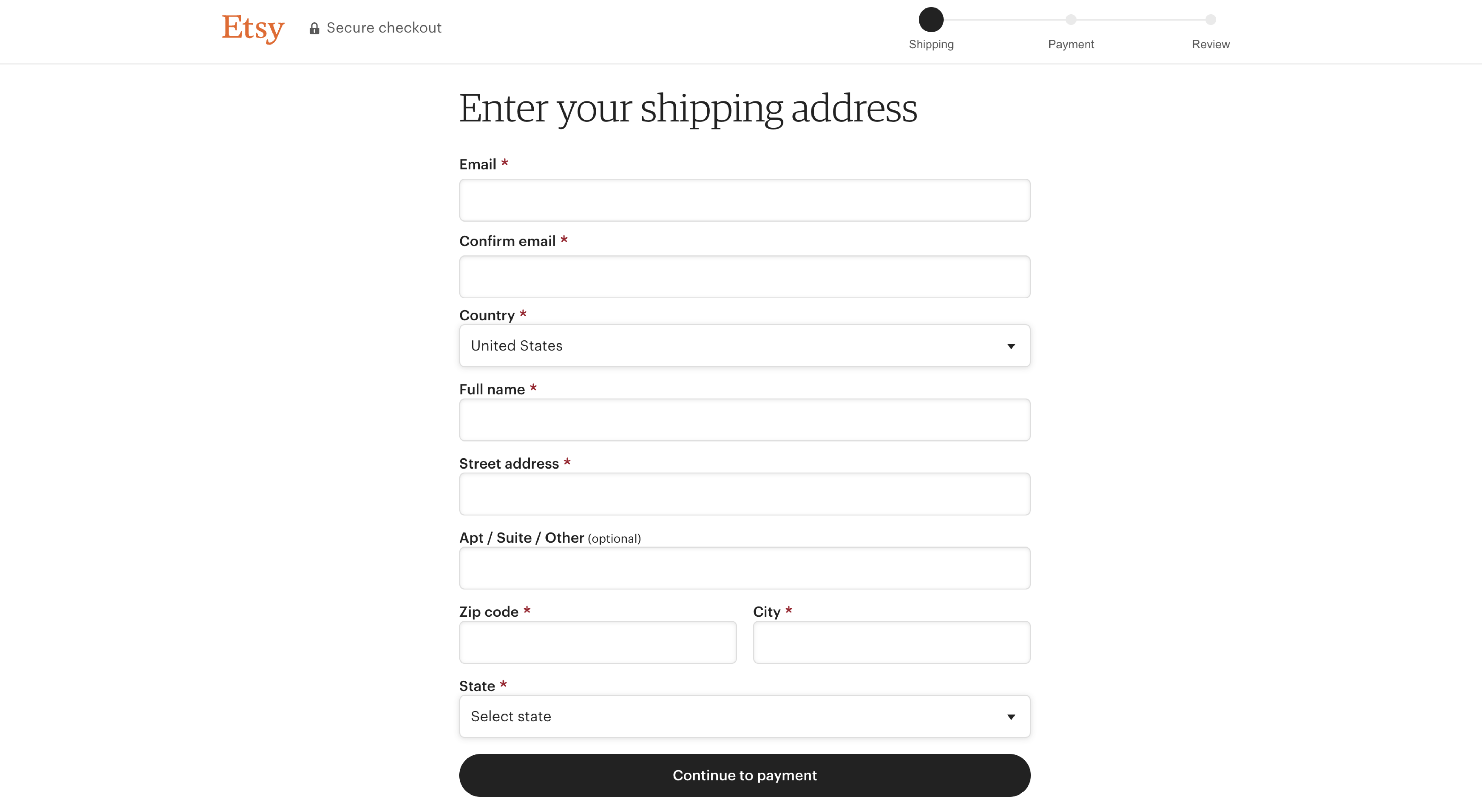
Biggest takeaway: A simplistic three-step payment process with minimal images and clear fields to input information easily.
With no images to distract customers from entering their details, Etsy’s simple checkout page is effective and to the point. Etsy effectively highlights the fields customers have to fill out while not requiring too much information out of them. Customers are able to complete the checkout process without having to create an Etsy account by simply checking out as a guest. Etsy might have one of the simplest payment pages on this list, but simplicity for checkout pages is effective.
3. ASOS
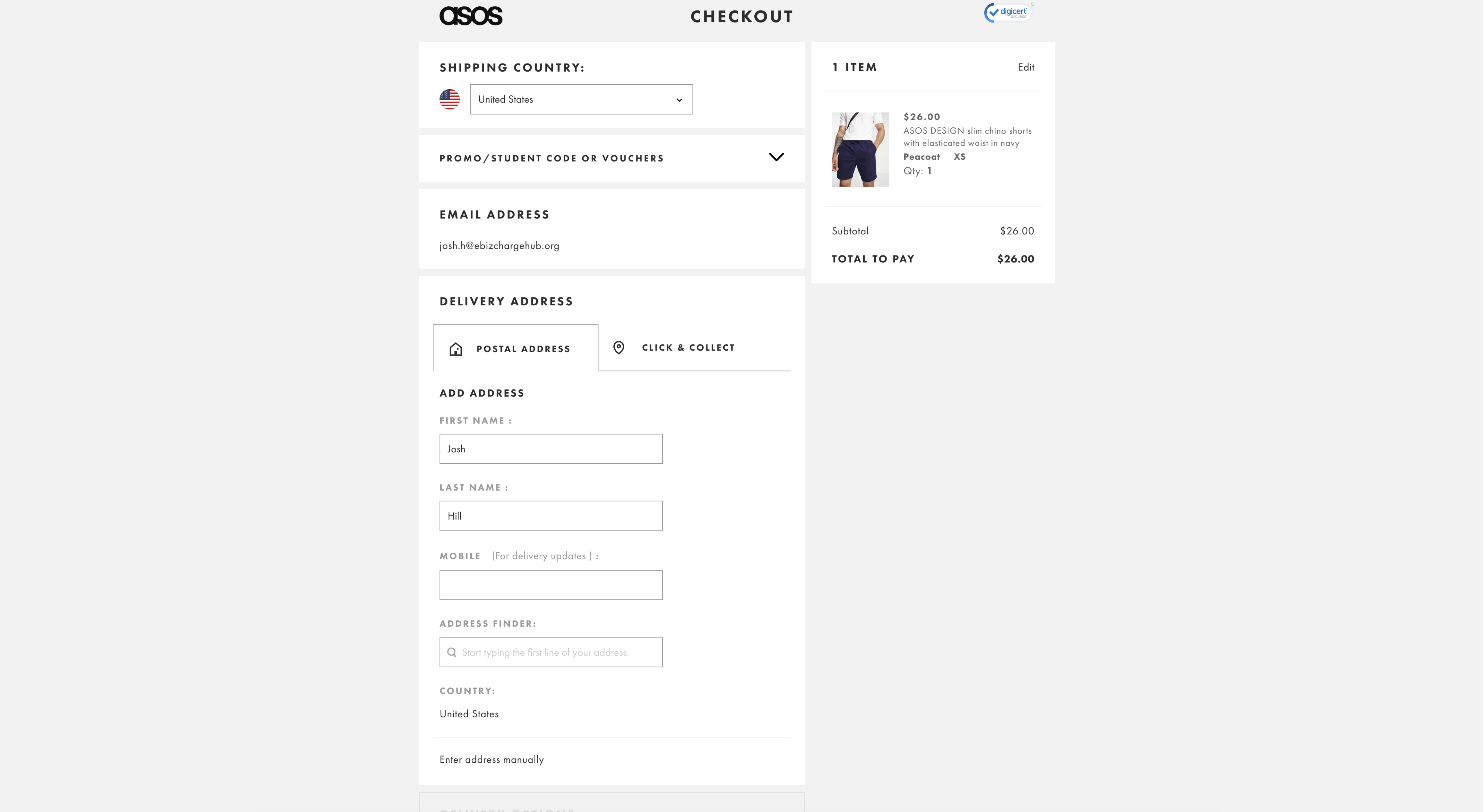
Biggest takeaway: ASOS utilizes a unique interface with easy-to-understand information fields and very little color to avoid distracting customer’s attention.
ASOS took a similar approach to Etsy by creating a payment page with very little colors or images and focusing on highlighting the important fields customers need to fill out to get their order completed. ASOS focused on having a trust symbol as their main image displaying to their customers that they practice excellent payment processing security and value their customers’ privacy.
With the positives mentioned about ASOS’s payment page, they could improve by limiting the number of steps it takes to finish the transaction. They have five steps that customers need to complete before the purchase is finalized while many other checkout pages in this article only have one to three steps. If the process is too long or difficult for customers, they might lose interest and give up on the transaction. When creating your own payment page, be sure to keep this in mind and limit the amount of steps to finish a transaction.
4. Nike
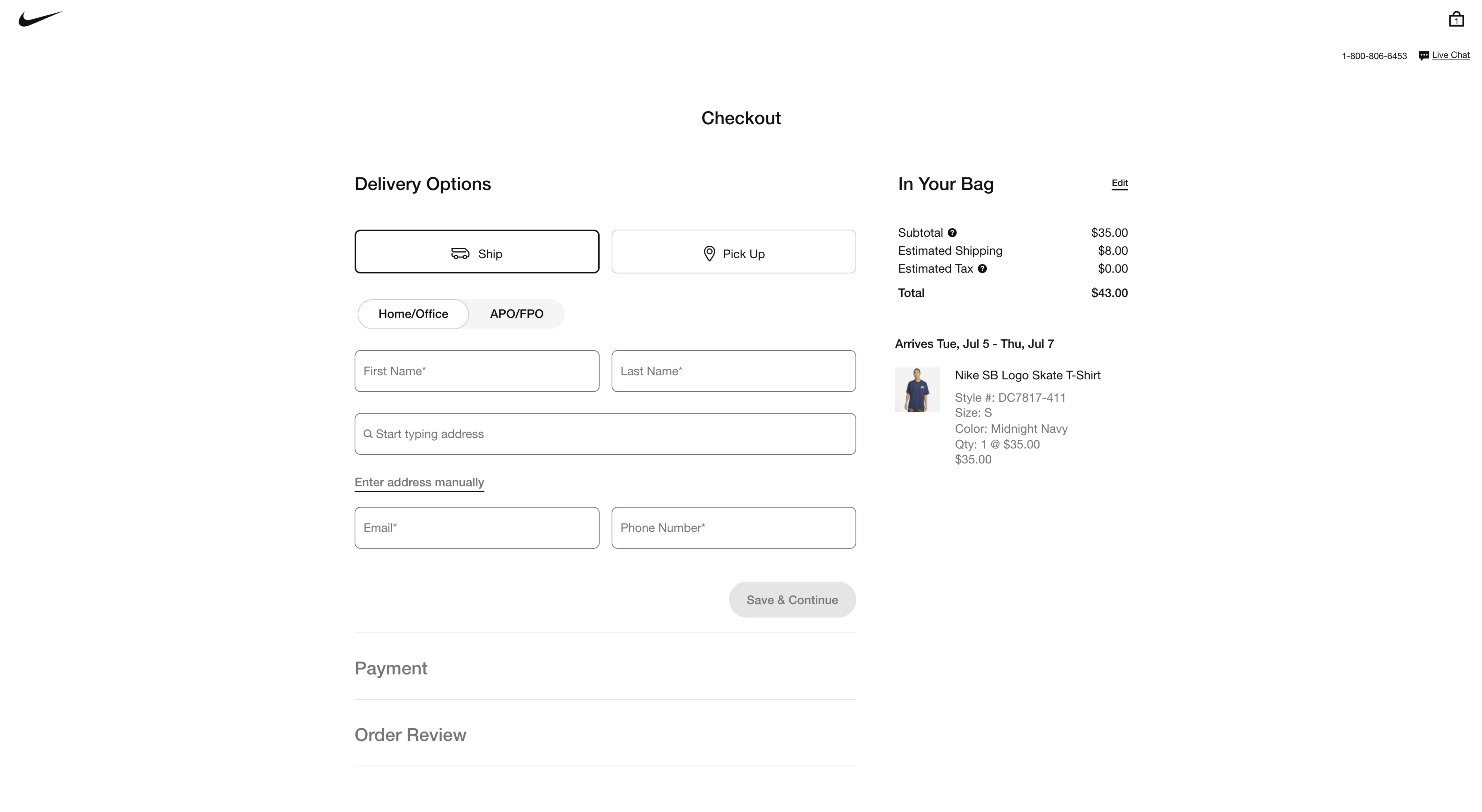
Biggest takeaway: Nike differentiates their checkout page by displaying the items in their customer’s bags with the price and image next to the customer details to ensure the customers know exactly what to expect from their orders.
The payment page feature of displaying the product images right at checkout is a nice touch allowing customers to review exactly what they’re purchasing before finalizing the transaction. These product images also motivate the customer to finish the purchase by exciting them with a photo of their purchase before the product arrives at their home. Nike utilizes a three-step process but created a display where all of the steps are on one page. This makes it easier for the customer to focus on finishing up the purchase and harder for them to get distracted and leave the page.
5. Minimalist Page Idea, by Eugene Lazarez
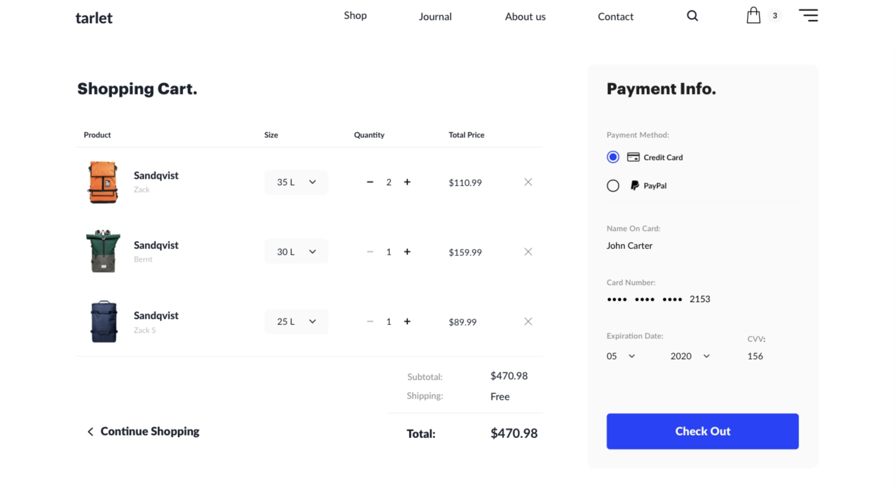
Biggest takeaway: This minimalist design has a large area on the payment page displaying the products’ photo, size, quantity, and price creating an environment where customers get excited about their purchase before finalizing the transaction.
This minimalist design by Eugene Lazarez is similar to the Nike design by effectively displaying the items directly on the checkout page to excite customers even further about their purchase. The design uses spaces between the text and images beautifully, highlighting the necessary text fields and making the images stand out. With everything on one page, customers only need to go through one effortless step. This saves them time and ensures that they will go through with the purchase allowing your business to get paid.
6. One Step Page Idea, by Kasper Christensen
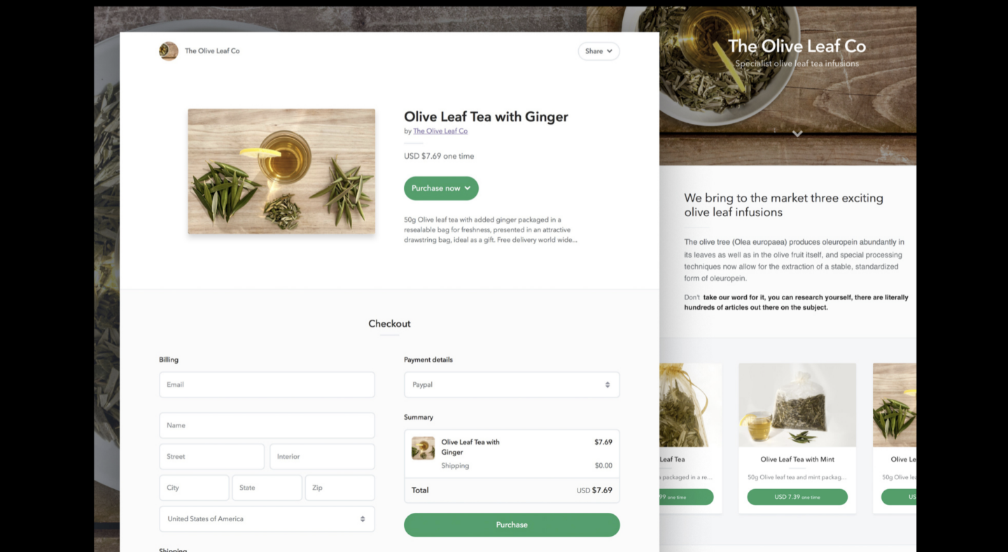
Biggest takeaway: This payment page design squeezed everything on one page including the product image making it easy for customers to quickly purchase their items.
This payment page design by Kasper Christensen introduces a one-step payment approach while displaying the products largely on the checkout page. The page also includes the product name with a description of the product in a very detailed manner. With clear, large text boxes, customers can easily enter in all of their personal information without being distracted by a poor interface or unnecessary text boxes.
Payment page advice
- Keep promo codes subtle. While it is nice to offer promos for your customers, having another field to fill in on your checkout page may be distracting for your customers and make them immediately want to fill in the empty space. Having a space for promo codes may motivate customers to leave your payment page and search Google for discounts. People could either find a promo code for your website or they may become distracted and forget about the transaction altogether. Not only are you at risk of losing revenue on your customer forgetting about the transaction, but customers could stumble upon a coupon for your competitor. Instead of having a large text box for promo codes, just include a small dropdown menu so customers with legitimate promo codes can still enter them in and receive a discount. Promo codes can be a huge tool to bring in new customers, but be careful when offering them and keep them subtle on your checkout page.
- Offer instant payment options like Apple Pay, Google Pay, and Click to Pay. The instant payment option is the quickest way for customers to provide all of their personal details and finalize the transaction. Not only are these payment options the fastest, but these are the most secure options for customers as well. Adding the one-click payment option to your payment page is a no-brainer if you want to make the transaction as simple as possible for your customers.
How does your checkout page compare to these 6 examples?
Now that you’ve seen the 6 excellent examples of intuitive checkout pages, look at your own payment page and see how it compares. If your payment page is lacking some or all of the features and elements of the 6 examples, you’ll probably want to take a step back and gain some inspiration from these examples to boost your payment page.
Another option is to use a payment processing company like EBizCharge, which allows you to personalize your customer checkout experience. EBizCharge has several unique payment solutions that allow your business to get paid on time and create an intuitive experience for your customers. EBizCharge is integrated into top eCommerce software and accounting ERP software to help customers collect payments faster, easier and more securely.
You can use EBizCharge within eCommerce platforms such as:
- 3DCart
- BigCommerce
- CartManager
- Kibo Commerce
- Magento
- Nomad
- Sana Commerce
- WebJaguar
- Zen Cart
- WooCommerce
- And others
EBizCharge is a great option if you want to simplify your accounting and create a personalized experience for your customers.
Simplify your payment page
Following the lead of the 6 checkout page examples in this article, your company should simplify its payment page to create an intuitive experience for your customers. Not only does simplifying the design of your payment page make it easier for your customers to navigate your website, but it speeds up the process of the transaction by minimizing the total steps.

